
Booking a cab shouldn't feel like filling out a government form. Yet, so many ride-booking apps make users jump through unnecessary hoops before they can simply get from point A to point B — endless permissions, cluttered screens, and forms that ask for things nobody actually needs to enter every single time.
When we set out to build Xamta, our goal was simple: make booking a ride feel as effortless as asking a friend for a lift. No confusion. No unnecessary steps. Just open the app, tell it where you want to go, and let the rest happen quietly in the background.
We didn't want users to think about the app while using it. The best products are the ones that disappear into the background of everyday life — you don't remember using them, you just remember getting where you needed to go, on time and without stress.
That belief shaped every decision we made — from how many taps it takes to book a ride, to how a single screen transition feels, to what information we choose to ask for (and just as importantly, what we choose not to ask). Every unnecessary field removed, every extra screen cut, was a small win in making the experience feel lighter.
Because at the end of the day, people aren't opening a ride-booking app to enjoy the app itself — they're opening it because they need to be somewhere. Our job was to get out of their way as fast as possible, while still making sure the ride feels safe, reliable, and personal.
Here's a peek into how we designed the entire user journey — from selecting a car to hopping in for the ride.
Choosing the Right Car for the Ride
The first thing a user does on Xamta is pick a car that fits their need. Not everyone wants the same ride — someone heading to the airport with luggage needs an SUV, while someone rushing to a meeting alone might just want a quick, affordable Mini.
We designed this screen to be visual and quick. Instead of long text descriptions, we used simple icons, clear pricing, and estimated arrival times so users can compare options in seconds. No confusion, no clutter — just a clean decision-making moment right at the start.
The idea here was simple: the first interaction should feel confident, not confusing.

Setting the Source and Destination
For the destination, we added smart suggestions based on recent searches and popular locations nearby. This small addition saves users a good few seconds every single time, and in a ride-booking app, speed is everything.
A map preview also shows the estimated route, so users know exactly what to expect before confirming.
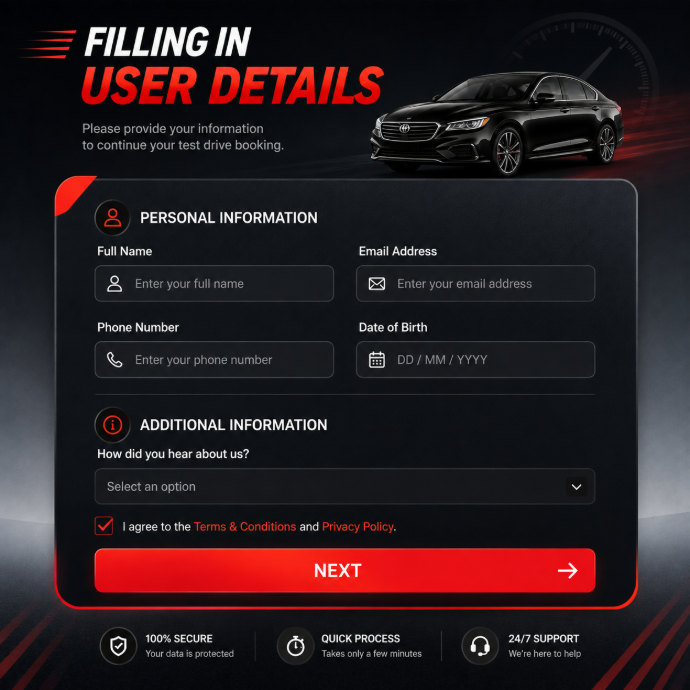
Filling in User Details
Here's where many apps lose users — long, tiring forms. We wanted to avoid that completely.
On Xamta, this step only asks for what's absolutely necessary: name and phone number. If it's a repeat user, most of these details are already saved, so this screen often takes less than five seconds to complete.
We also added an optional "pickup note" field, so users can mention things like "I'll be near the blue gate" or "please call before arriving." It's a small touch, but it removes a lot of back-and-forth confusion between the rider and driver.
OTP Verification — The Final Trust Check
The last step before confirming the booking is OTP verification. This isn't just a technical formality — it's a trust layer. It ensures that the person booking the ride is genuinely present and the number belongs to them.
We kept this screen minimal — a clean OTP input box, an auto-read feature for supported devices (so users don't even have to manually type the code), and a clear "Verify" button. Once verified, the booking is instantly confirmed, and the user is shown live driver details — name, car number, and estimated arrival time.
Why This Flow Works
The magic of a good product isn't in flashy animations or complicated features — it's in how little friction the user feels while getting things done. Every screen in Xamta's booking flow was designed with one question in mind: "Does this step earn its place, or is it slowing the user down?"
By keeping the flow to just four clear steps — car selection, route selection, user details, and OTP verification — we made sure that booking a ride feels quick, safe, and human.
That's the real goal behind good UX: not to impress users with design, but to get out of their way so they can go where they need to go.
Good design is never really "finished." As more people use Xamta, we keep learning — which steps feel smooth, where people hesitate, and where we can shave off even a second or two more. Every version of this flow is better than the last, not because we added more, but because we kept asking what we could take away.
That's the mindset we want to carry forward: build less, but build it right. A booking flow isn't just a set of screens — it's a promise. A promise that when someone needs to go somewhere, the app will be ready, simple, and just... work.
So the next time you open Xamta and book a ride in a few taps, know that behind that simplicity is a lot of thought, testing, and care. Because to us, a great ride doesn't just start when you get in the car — it starts the moment you open the app.
We're just getting started